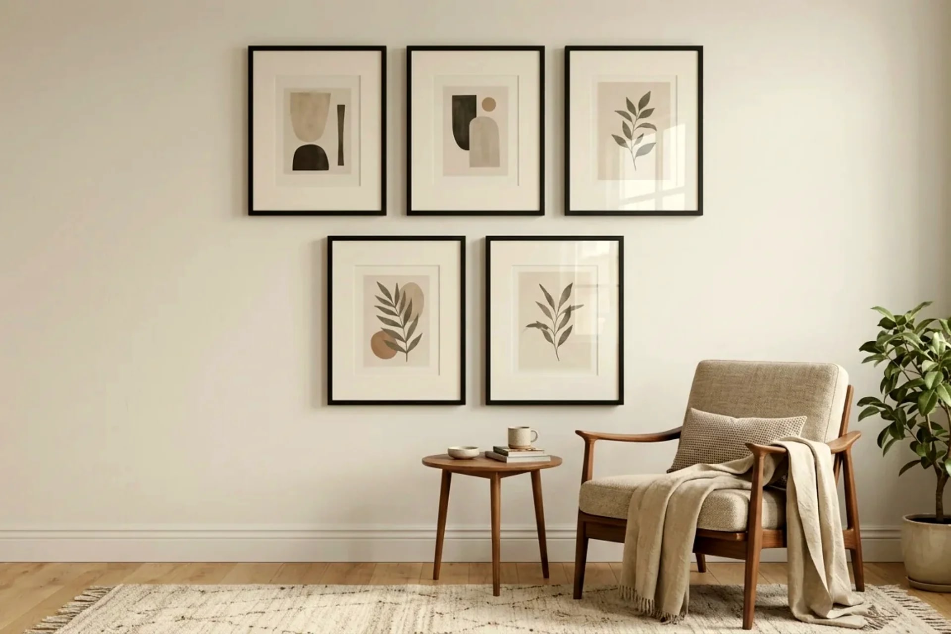
Here's the open secret of the frame world: the mat matters more than the frame. A $3 thrifted frame with a well-cut mat looks expensive; a $60 frame with no mat looks like a poster taped to cardboard. Matting is the white space that tells the eye "this is art" — and it's the cheapest upgrade in all of wall decor.
If you're flipping thrift finds, see our thrifted frame makeover tutorial and thrift store frame flips guide for the paint side — this guide is the finishing side. New to wall decor overall? Start with the DIY wall decor beginner's guide.
Key Takeaways
- The pro rule: mat borders 7–10 cm wide; bottom border ~0.5–1 cm wider than the top (bottom-weighted)
- DIY mat cutting: a $15 mat cutter + metal ruler + practice board = gallery bevels at home
- Safest color: warm white / off-white mat with white core — works with 90% of art and frames
- Unifying trick: same mat color across different frames makes any mismatched set look intentional
- Cost: $2–$5 per DIY mat vs $12–$25 for custom-cut
Table of Contents
- Why matting changes everything
- Mat proportions that look pro
- Cutting your own mats: step by step
- No-cut alternatives
- Color and material rules
- Styling mixed thrifted frames as one set
- Hanging and spacing
- Frequently asked questions
Why matting changes everything
A mat does three jobs. First, visual breathing room: art crammed edge-to-edge in a frame feels claustrophobic; the same art floating in white space feels considered. Second, perceived value: galleries mat everything, so our brains read "matted" as "valuable" — it's a $3 psychological upgrade. Third, protection: the mat keeps the art from touching the glass, which prevents moisture transfer and sticking over time (important for anything you'll keep for years).
The thrifted-frame connection: thrift frames come in random sizes, and your art comes in standard sizes. The mat bridges the gap — a 20×25 cm print in a 40×50 cm frame with a wide mat looks deliberate, not like a sizing accident. Matting is what makes odd-size thrift finds usable.
Mat proportions that look pro
Border width: 7–10 cm per side for most pieces. Smaller than 5 cm looks stingy; wider than 12 cm starts to swallow small art. The classic gallery look is a generous border — when in doubt, go wider.
Bottom-weighted: the bottom border should be about 0.5–1 cm wider than the top and sides. This is the subtle pro tell. Perfectly equal borders create a slight optical illusion that the art is sinking; the extra bottom weight corrects it. Nobody can name why it looks better — it just does.
The formula: For art of size A×B in a frame of size F1×F2:
- Mat outer dimensions = frame's rabbet opening (the inner lip), roughly frame size minus 1–2 cm
- Mat window opening = art size minus 0.5 cm overlap per side (the mat must overlap the art edges slightly to hold it)
- Border widths = (mat outer − window) ÷ 2, then add 0.5–1 cm to the bottom
Example: 20×25 cm print in a 40×50 cm frame. Mat outer ≈ 38×48 cm. Window = 19×24 cm. Side borders ≈ 9.5 cm, top ≈ 12 cm... wait, that gives a very tall top. In practice: window centered left-right, top border ~9 cm, bottom border ~10 cm. The math gets you close; your eye finishes the job. Slightly bottom-heavy always wins.
Oversized mat trick: for tiny art (a 13×18 cm photo) in a big frame, go extreme — 12–15 cm borders. The art becomes a jewel in white space. This is the single most effective way to make small thrift finds look like serious art.
Cutting your own mats: step by step
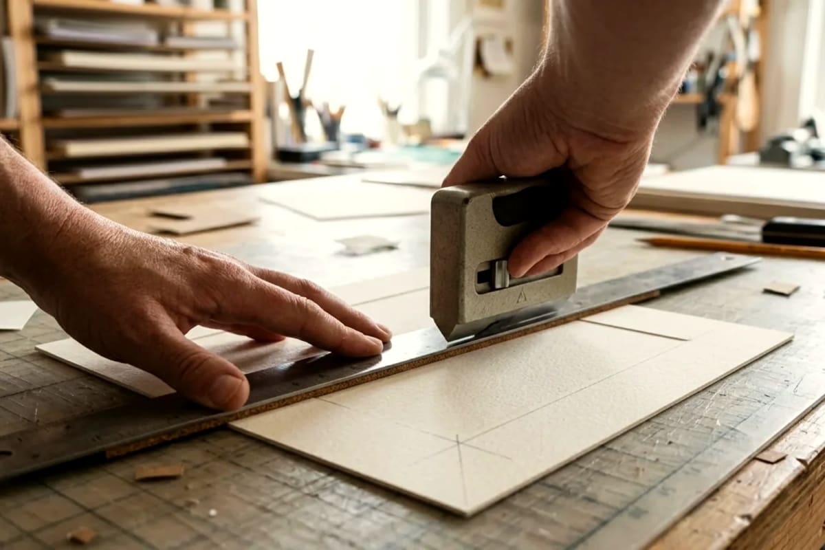
Tools ($15–$25 total): a handheld mat cutter (the $12–$18 kind with a replaceable blade — not a craft knife, the angled blade is the whole point), a metal ruler or T-square, a self-healing cutting mat or spare board underneath, and pencil. Plus practice board: cut your first 2–3 mats from scrap cardboard, not your good mat board.
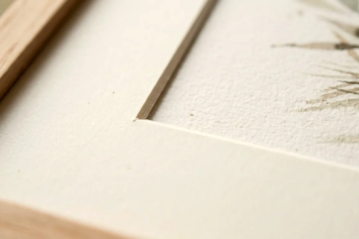
Mat board: buy 4-ply (standard, ~1.4 mm) conservation or acid-free board. Regular craft board yellows and can stain art over years — acid-free costs barely more ($3–$6 per 50×65 cm sheet, which yields 1–2 mats). White core vs cream core: white core shows a crisp white bevel line (modern); cream core shows warm (traditional).
The process:
- Mark the outer dimensions on the back of the board. Cut the outer rectangle first with the metal ruler — straight, confident, single passes. Multiple hesitant passes = wavy edges.
- Mark the window on the back, centered per your proportions (remember: bottom-weighted). Double-check with a ruler — measure twice, cut once is never more true than here.
- Set the cutter blade depth to just barely cut through the board — too deep scores your cutting surface and drags; too shallow leaves uncut fibers. Test on scrap.
- Cut the window with the bevel facing the right way. The mat cutter's angled blade creates the 45° bevel automatically — but only if the blade leans the correct direction (blade angled so the bevel slopes inward toward the window, wider at the back). Every beginner cuts at least one bevel backwards. That's what the practice board is for.
- Cut in one continuous motion per side, starting and stopping slightly past the corners (overcut ~2 mm). Stopping exactly at the corner leaves uncut tags; the tiny overcut disappears into the corner.
- Pop the window out gently. If it resists, your blade was too shallow — don't force it, re-cut.
The feel: firm, even pressure, steady speed. Think slicing, not sawing. Your first mat will take 20 minutes; your fifth will take 5.
Blade rule: fresh blade per 2–3 mats. A dull blade tears the bevel edge — the ragged white line is visible from across the room. Blades are cheap; ruined board isn't.
No-cut alternatives
Cutting isn't mandatory. Honest alternatives, ranked:
- Pre-cut mats ($3–$8): standard sizes with standard windows, available everywhere. The limitation is proportions — they're equal-bordered, not bottom-weighted, and the window rarely matches your art exactly. Fine for 80% of projects.
- Have them cut ($8–$15 at a frame shop or craft store): bring your dimensions, get a perfect bevel in 10 minutes. Best for oversized or odd sizes where your skill isn't there yet.
- Float mounting: mount the art on top of a full mat board (no window cut) with the edges visible — modern, easy, no cutting. Works beautifully for thick pieces (canvas paper, plaster minis) that can't go behind a window anyway.
- Full-bleed: skip the mat, let art go edge to edge. Valid choice for bold graphic prints — but it's a style decision, not a shortcut; it only works when the art is strong enough to carry it.
Color and material rules
The 90% answer: warm white / off-white mat, white core. It works with black frames, wood frames, gold frames, colorful art, black-and-white photos — everything. If you mat twenty thrifted frames in your life, mat eighteen of them warm white.
When to go black: white or light art on a black mat in a black frame = dramatic, gallery-grade. Black mats also rescue weak art — the contrast adds punch the art lacks. But black shows every dust speck and fingerprint; handle with clean hands.
When to go colored: sparingly. A colored mat should pull one color from the art — sage from the landscape, terracotta from the pottery photo. The mat is a supporting actor; if it competes with the art, it's wrong. Double mats (thin inner accent color + wide outer neutral) give you the color pop without the risk.
Texture: linen-textured mat board reads as more expensive than smooth — worth the small premium for statement pieces. Skip suede-textured (dust magnet) and metallic (dated fast).
Core color as a design choice: white core = crisp modern bevel line; black core (black board throughout) = dramatic dark bevel, stunning with black mats; cream core = soft traditional. The bevel line is a 2 mm design element most people never notice consciously — but it registers.
Styling mixed thrifted frames as one set
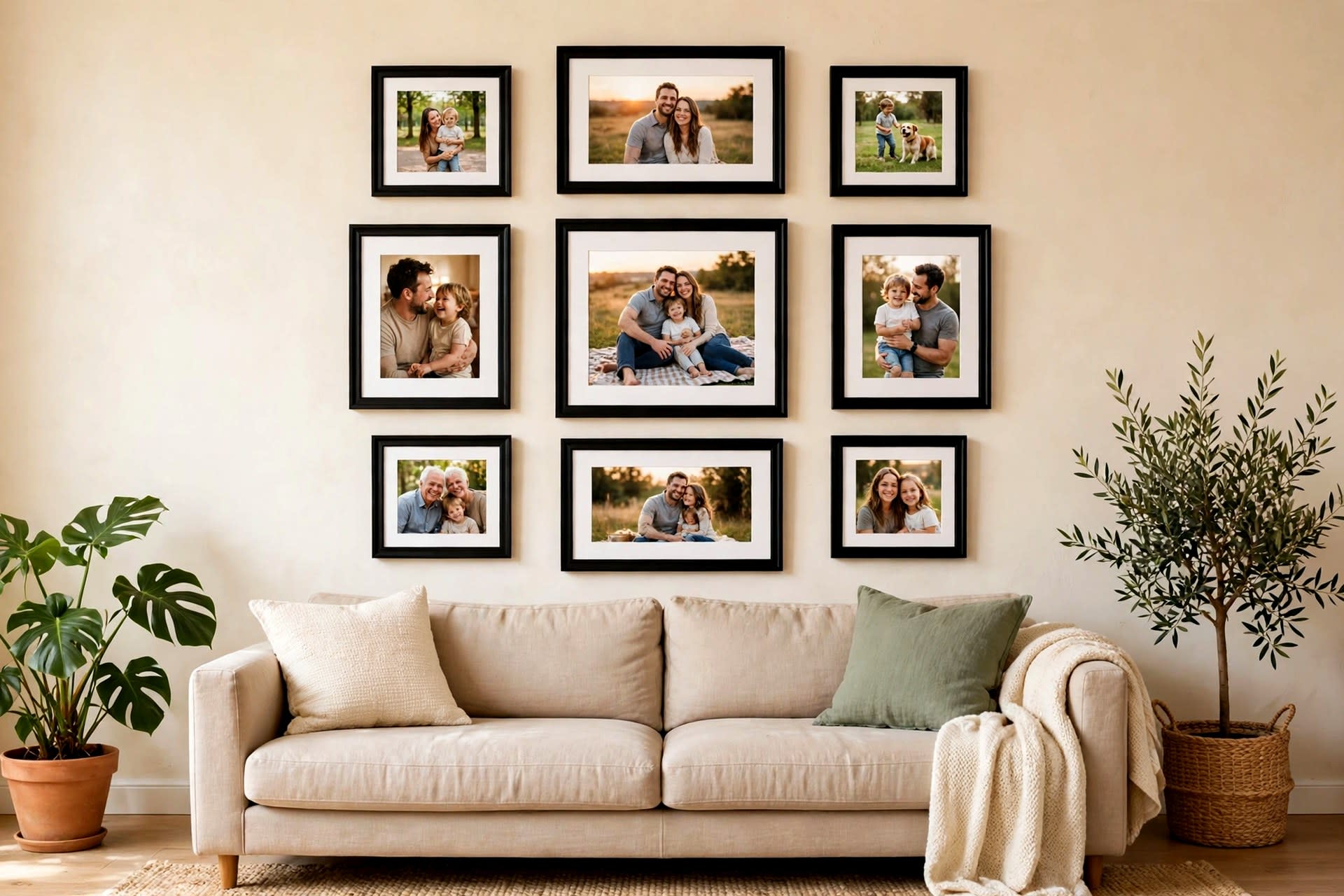
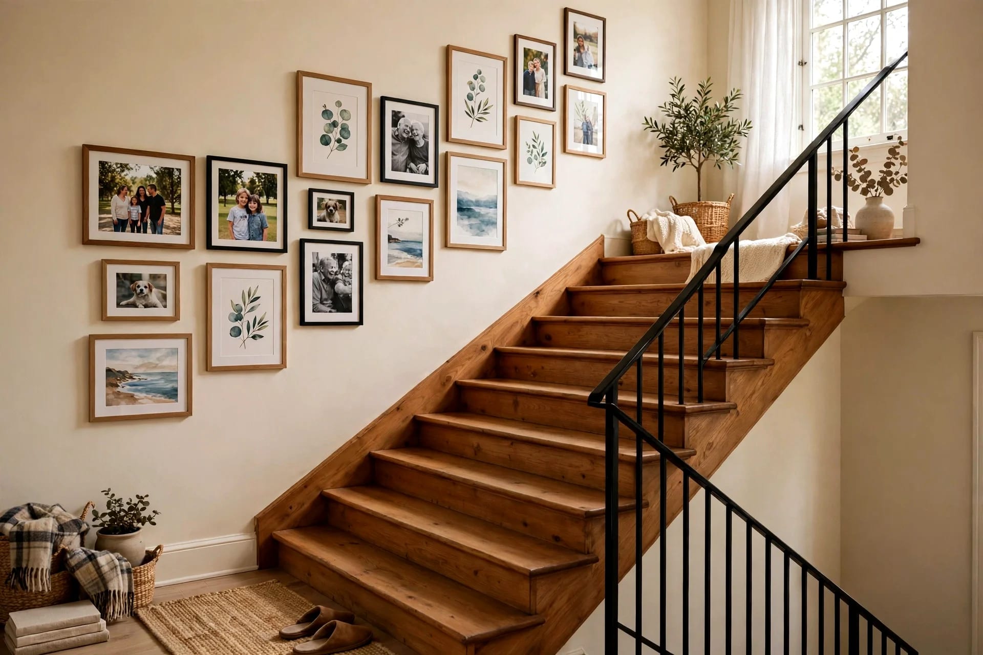
Random thrifted frames become a cohesive gallery with three unifiers — you only need two of the three:
- Same mat color. Five different frames, all with warm-white mats: instantly a set. This is the highest-leverage unifier and the reason to standardize your mat color.
The formula that never fails: different frame shapes + same mat color + same frame color family + 5–7 cm equal gaps + one horizontal centerline. It works with literal garbage frames. I've seen $8 of thrift frames outclass $400 of matching retail frames on this formula alone.
What goes where: put the largest piece slightly off-center (never dead center — it's static), build outward, keep the visual weight balanced left-right. Step back 3 meters after every 2–3 frames. Your phone camera is a ruthless editor — photograph the arrangement and the flaws jump out.
Hanging and spacing
- Center height: 145 cm from floor to the center of the arrangement (gallery standard, average eye level). In dining rooms where people sit, drop to 130–135 cm.
- Spacing: 5–7 cm between frames for a tight gallery; 8–12 cm for an airy feel. Pick one and be consistent — inconsistent gaps are what make galleries look accidental.
- Above furniture: bottom of the lowest frame 15–20 cm above the sofa/console top. Closer feels connected; floating high feels lost.
- The paper template trick: trace each frame on kraft paper, tape the templates to the wall, live with it a day, adjust, then hang. For damage-free hanging, this step is doubly valuable — you commit the layout before committing adhesive.
Frequently asked questions
What size mat do I need for my frame? Mat outer = your frame's inner opening (frame size minus ~1–2 cm for the rabbet lip). Window = art size minus 1 cm total (0.5 cm overlap per side to hold the art). Borders of 7–10 cm with a slightly wider bottom look professional.
Can I cut mats without a mat cutter? A craft knife + metal ruler works but won't give you the 45° bevel — you get a straight 90° cut, which looks fine but not gallery-grade. The $15 mat cutter exists precisely for the bevel; it's the cheapest pro upgrade in framing.
Should the mat be lighter or darker than the art? Lighter, almost always. A mat darker than the art traps it visually — the eye reads the dark mat as the boundary and the art shrinks. Light mats expand; dark mats contract. The exception is deliberate drama (white art, black mat).
How do I keep art from slipping behind the mat? Hinge-mount with archival tape at the top edge only (lets the art expand/contract with humidity), or use photo corners. Never glue all four edges — trapped art buckles with seasonal humidity changes.
Is it worth matting cheap prints? It's the highest-ROI move in framing: a $1 print with a $3 DIY mat in a $3 flipped frame reads as a $50 piece. Matting is literally what separates "printout" from "art" in the viewer's mind.
What's the difference between 2-ply and 4-ply mat board? 4-ply (~1.4 mm) is the standard — rigid enough to stay flat, thick enough for a visible bevel. 2-ply is flimsy and warps; 8-ply is luxury (deep dramatic bevel, expensive). For DIY, 4-ply acid-free is the answer every time.