
Color is the highest-leverage decision in a small living room. The right palette dissolves boundaries and bounces light; the wrong one chops the room into visual pieces that each feel smaller than the whole. These six schemes are all proven in real small rooms — each with exact shade guidance and what to avoid.
If you want the deep-dive on individual paint shades first, see our best paint colors for small living rooms. This article is about schemes — how colors work together across walls, furniture, and textiles. For the full room playbook, start with small living room ideas.
Key Takeaways
- The principle: low-contrast schemes (colors close in lightness) dissolve boundaries; high contrast chops the room up
- The formula: 60% dominant (walls), 30% secondary (sofa, rug), 10% accent (pillows, art) — keep the 60% light
- Safest palettes: warm white + greige, sage + cream, pale blue-gray + white
- The dark exception: one charcoal or deep-green accent wall works — but only with 2700K lighting and light everything-else
- Cost: paint is $30–$60 per wall; a full scheme refresh via textiles alone runs $80–$150
Table of Contents
- The rule behind all six palettes
- 1. Warm white and greige
- 2. Soft sage and cream
- 3. Pale blue-gray and white
- 4. Terracotta accents on warm neutral
- 5. Monochrome beige layering
- 6. Charcoal accent wall, done right
- The 60-30-10 rule for small rooms
- The takeaway
- Frequently asked questions
The rule behind all six palettes
Every palette below obeys one rule: keep contrast low between the big surfaces. When walls, sofa, and rug sit close in lightness, the eye can't find where one ends and the next begins — and a room with no visible boundaries feels bigger than its measurements.
This doesn't mean everything beige. It means the steps between colors are small. A sage wall, cream sofa, and oatmeal rug have plenty of character — they just don't fight each other.
Light reflectance value (LRV) is the number to watch on paint chips: 0 (pitch black) to 100 (pure white). For small-room walls, stay in the 65–85 LRV range. Below 60 and the walls start advancing toward you; above 90 and you get a flat, clinical glare.
1. Warm white and greige
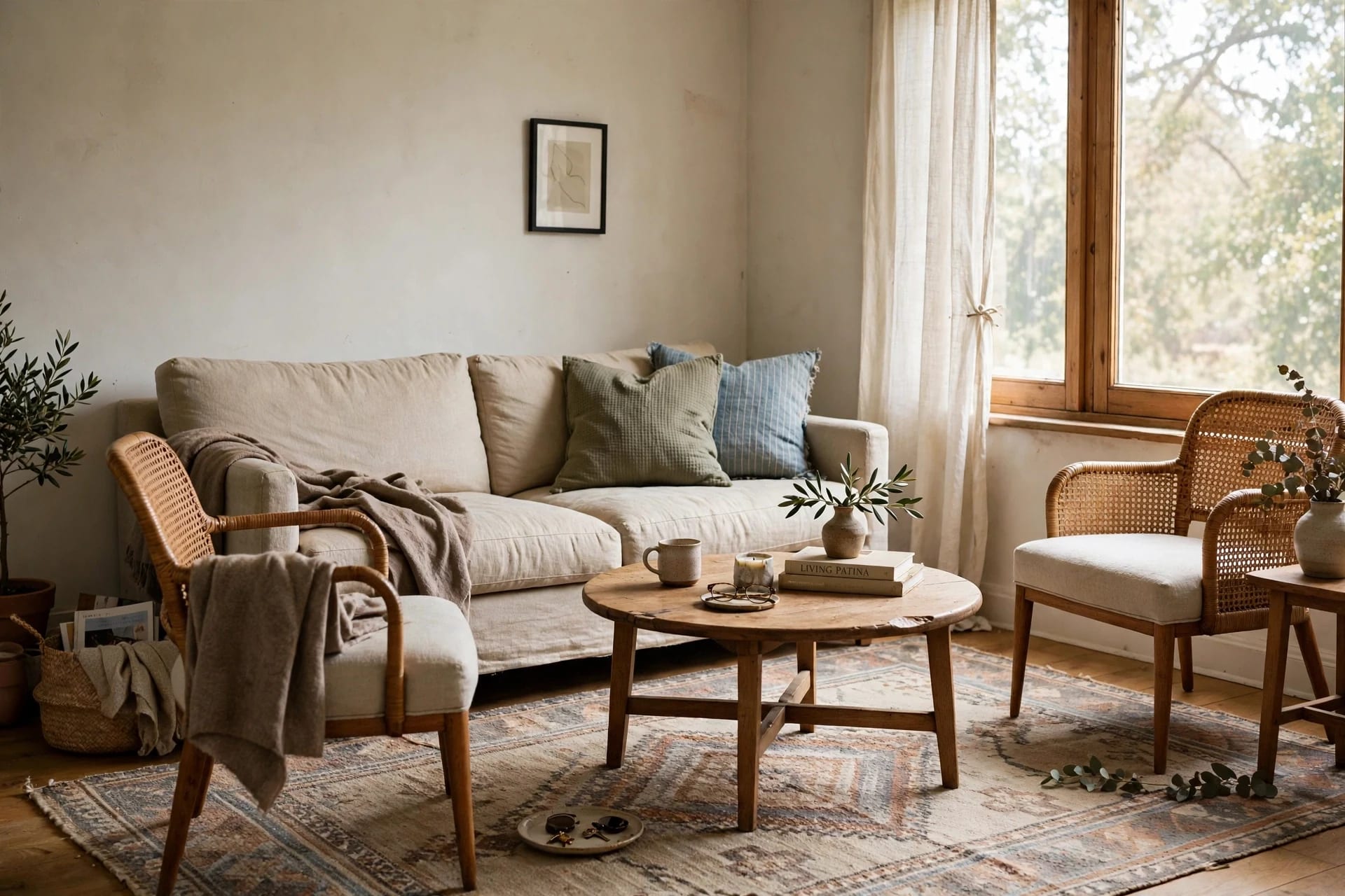
The palette: warm white walls (LRV 80–85), greige sofa and textiles (LRV 55–65), oak or light wood accents, one black or bronze detail for grounding.
Why it works: this is the safest small-room scheme ever devised. Warm white (not stark white — look for names with "warm," "ivory," or "linen") reflects ~80% of light while staying soft at the edges. Greige — the gray-beige hybrid — adds just enough depth to keep the room from feeling washed out, without introducing real contrast.
Exact guidance:
- Walls: warm white, LRV 80+. Paint a 60×60 cm tester and check it at noon and at 8 pm under your lamps. Warm whites go yellow under 2700K bulbs (fine, even good); in north light they can go green-gray, so pick one with a touch more warmth.
- Sofa: greige or warm light gray upholstery — hides wear, matches everything, never fights the walls.
- The 10%: one dark anchor — a black floor lamp, bronze mirror frame, dark wood side table. Without it the scheme floats; with it, everything looks intentional.
Cost: repainting ~$40 in paint for an average living room's walls; the scheme works with whatever furniture you own.
2. Soft sage and cream
The palette: soft sage green walls (LRV 60–70), cream and ivory textiles, light oak wood, brushed brass accents.
Why it works: sage has enough pigment to feel designed, but it's desaturated enough to recede like a neutral. Green sits in the middle of the visible spectrum, so the eye focuses on it effortlessly — rooms in mid-spectrum colors feel restful, and restful reads as spacious.
Exact guidance:
- Walls: muted sage, not mint (mint is too cool and bright — it advances). Look for "sage" or "eucalyptus" names; LRV 60–70.
- Keep the ceiling and trim warm white — sage everywhere is too much envelope; the white ceiling keeps the height.
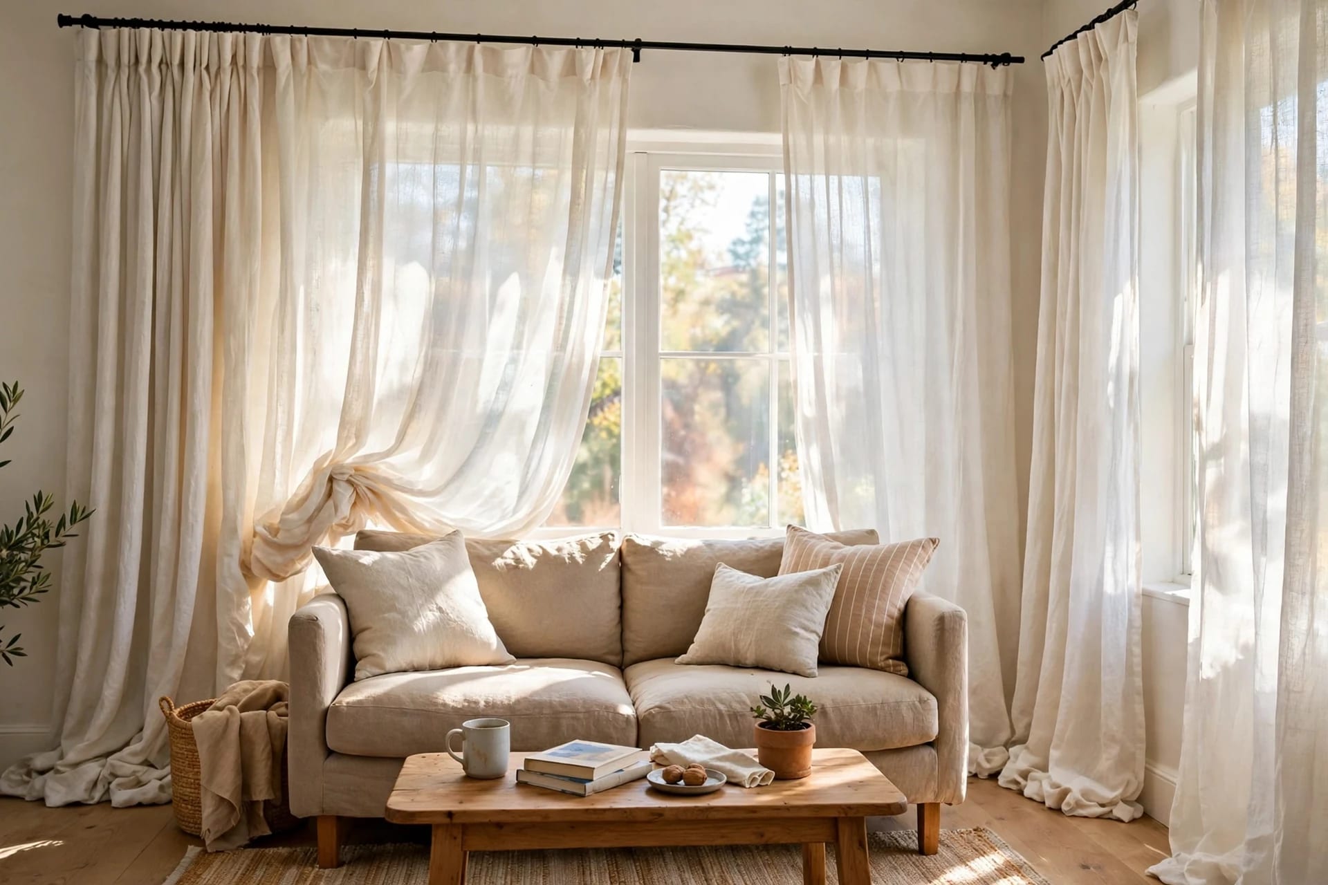
- Textiles: cream linen curtains, ivory throw, one deeper green cushion. Natural materials (linen, jute, oak) are sage's best friends.
- Avoid: pairing sage with gray — it goes muddy. Sage wants warmth (cream, oak, brass).
Best for: rooms with decent daylight — sage needs light to show its softness; in a dark north-facing room it can go murky. Dark room? Use palette #1 or #3 instead.

3. Pale blue-gray and white
The palette: pale blue-gray walls (LRV 65–75), crisp white trim and ceiling, light gray or white upholstery, silver/chrome or light wood accents.
Why it works: cool colors recede — it's atmospheric perspective, the same reason distant mountains look blue. A pale blue-gray wall genuinely looks farther away than a beige wall at the same distance. This is the palette that makes the smallest rooms feel airy.
Exact guidance:
- Walls: blue-gray with LRV 65–75. Too pale reads as dirty white; too saturated becomes a blue room.
- Warm lighting required: cool walls + cool bulbs = laboratory. This palette needs 2700K–3000K warm light to stay inviting.
- Textiles: white and light gray, one navy cushion for depth. Keep patterns small-scale — large patterns chop up small rooms.
- Wood: light oak or ash only. Dark walnut is gorgeous in big rooms and heavy in small ones.
Best for: the smallest rooms, especially ones that run warm (south/west facing) — the cool palette balances the warm light beautifully.
4. Terracotta accents on warm neutral
The palette: warm neutral walls (greige/ivory, LRV 70–80), terracotta/rust accents in the 10% slot, cream textiles, dark wood touches.
Why it works: this is for people who find all-neutral schemes boring but don't want to gamble the room's spaciousness. The walls stay light and receding; all the personality lives in the easily-changed 10% — cushions, a throw, one art print, a vase. You get warmth and character with zero risk to perceived size.
Exact guidance:
- Walls: keep them neutral and light — terracotta must be the only saturated color. Two saturated colors in a small room compete, and competition reads as smaller.
- The 10% in terracotta: 2–3 rust cushions, one throw or one art print (not both large), a small vase. That's the full dose.
- Balance with dark wood: a walnut side table or dark frame edges keep the palette from feeling too sweet.
Cost: the cheapest transformation on this list — $40–$80 in cushions and a throw, zero painting.
5. Monochrome beige layering
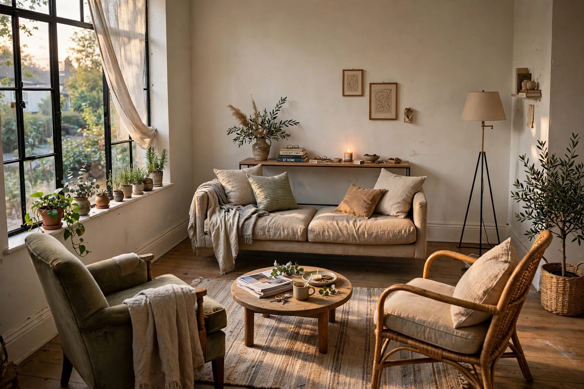
The palette: beige, oatmeal, camel, and cream — one color family, four to five shades, layered across every surface.
Why it works: this is low-contrast taken to its logical extreme. With no hue changes at all, the eye finds zero boundaries — the room becomes one continuous tonal field. It's the most spacious-feeling scheme possible, and the most forgiving: you cannot clash.
Exact guidance:
- Texture does the work color usually does. Five beiges in boucle, linen, jute, oak, and ceramic = rich and deliberate. When hue is constant, texture becomes the design.
- Layer light to dark: lightest on walls (LRV 80+), mid-tones on big furniture (LRV 55–65), deepest on small accents (LRV 40–50). The gradient gives the eye a path to follow.
- One metallic: brushed brass or champagne — beige needs a light-catching moment or it goes matte-flat. A brass floor lamp or mirror frame, just one.
Best for: minimalists, and rooms where you want art or a view to be the star — the palette disappears so the focal point shines.

6. Charcoal accent wall, done right
The palette: one charcoal or deep-green accent wall (LRV 10–20), everything else warm white and light.
Why it (counterintuitively) works: a dark wall behind the sofa or TV recedes — dark values advance in bright light but recede in dim interiors, and the contrast makes the light walls look lighter and farther by comparison. Done right, it adds depth the way a dark frame makes a photo pop. Done wrong, it's a cave.
The rules — all of them, no skipping:
- One wall only. Two dark walls in a small room is a cave; one is depth.
- The right wall: behind the sofa or behind the TV — never the window wall (kills daylight).
- Warm lighting is mandatory: 2700K, and more of it than usual — dark walls absorb ~85% of light, so add one extra lamp.
- Keep everything else light: sofa, rug, curtains all in the 60+ LRV range.
- Matte finish only: eggshell or matte — shiny dark paint shows every roller mark.
Best for: TV walls (the dark wall hides the black screen — the TV visually disappears) and rooms with strong daylight to compensate. If the room is dark and small, skip this one.
The 60-30-10 rule for small rooms
Whatever palette you pick, distribute it like this:
- 60% dominant: walls (and ceiling). Always the lightest value in the scheme — the 60% sets the room's perceived size.
- 30% secondary: sofa, rug, curtains. One to two steps darker than the walls — this is where the palette's character lives.
- 10% accent: cushions, throws, art, small decor. The only place for saturated color or dark values — and the cheapest to change.
The rug connection: the rug is the biggest 30% item after the sofa — get its tone right and the scheme clicks. Our rug size guide covers dimensions; for color, the rug should sit between the wall and sofa in lightness, never darker than both.
The takeaway
Small rooms want low contrast, light 60%s, and personality confined to the changeable 10%. Pick one palette, commit to the 60-30-10 split, and let texture do the talking. And remember the multiplier nobody budgets for: the right bulb temperature (2700K) makes every palette on this page look 20% better for under $15. Paint is $30–$60 a wall; confidence in the scheme is free once you understand the rule.
Frequently asked questions
What is the best color scheme for a small living room? Warm white walls + greige furniture + one dark anchor is the safest and most proven. Sage-and-cream and pale blue-gray are strong alternatives with more personality.
Should small living rooms be light or dark? Predominantly light — the 60% (walls) should always be light (LRV 65+) in a small room. One dark accent wall can add depth, but only with warm lighting and light everything-else. All-dark small rooms feel smaller, full stop.
Does a dark accent wall make a small room look smaller? One dark wall, done right (behind sofa/TV, matte, warm lighting, light neighbors), adds depth. Two or more dark walls, or dark with cool lighting, will shrink the room.
What is the 60-30-10 rule? 60% dominant color (walls, lightest), 30% secondary (sofa, rug — one step darker), 10% accent (cushions, decor — where saturated color lives). In small rooms the 60% must stay light; the rule keeps contrast controlled so boundaries dissolve.
Which paint finish is best for small living rooms? Eggshell or matte on walls — flat enough to hide imperfections, which matters more in small rooms where walls are always close. Avoid high-gloss on large walls (shows every flaw); save satin/semi-gloss for trim only.
Can I use bold colors in a small living room? Yes — in the 10% accent slot only. Bold cushions, one art print, a vase: all changeable, all low-risk. Keep walls and furniture calm, and bold accents add character without costing space.