Key Takeaways
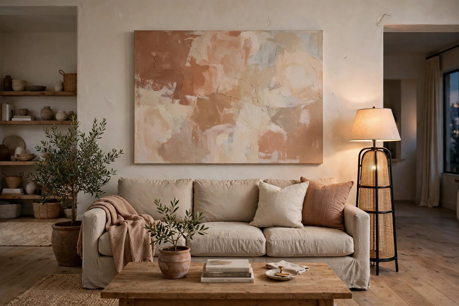
- Three numbers solve the above-sofa wall: art roughly two-thirds of the sofa's width, a gap of 6 to 10 inches above the sofa back, and a center at 57 to 60 inches from the floor.
- When the gap rule and the eye-level rule disagree, keep the art close to the sofa: it must read as a group with the furniture, not float on its own.
- The most common mistake is buying art too small. If you are between two sizes, take the larger one.
- A gallery wall follows the same rules: treat the whole grouping as one block, two-thirds of the sofa's width, with 2 to 3 inches between frames.
- Renters can get the same look with a picture ledge, a leaning piece, or adhesive strips, provided the weight is checked first.
Table of Contents
- The three numbers that matter
- Sizing chart: what fits above which sofa
- One piece, gallery, triptych, or ledge
- The gallery math, worked out
- When the rules disagree
- Renter-friendly ways to fill the wall
- Style choices that make it look intentional
- Mistakes to avoid
The three numbers that matter
The wall above the sofa is the most-asked-about wall art situation in any home, and it is also the easiest to get right, because three measurements cover nearly every case.
Width: about two-thirds of the sofa. A piece narrower than half the sofa looks stranded. Two-thirds to three-quarters is the range that looks intentional. This applies whether the "piece" is one canvas or a whole gallery wall treated as a single block.
Gap: 6 to 10 inches above the sofa back. Closer than about 6 inches and the art looks like it is resting on the furniture. Further than about 12 and the two stop reading as a group, and the art starts to float. Eight inches is a reliable default, and in rooms with lower ceilings it is worth leaning toward 6, while taller rooms can take 10.
Center: 57 to 60 inches from the floor. Galleries and museums hang to a center line around 57 inches because that is roughly average adult eye level, and using it consistently is what makes a home feel curated rather than improvised. Note that it applies to the center of the piece, not the top, the bottom, or the hook.
Memorize those three and you can size and hang almost anything above a sofa without a second opinion.
Sizing chart: what fits above which sofa
Measure your sofa's width first, then aim for a single piece, or a grouping treated as one block, inside this range.
| Sofa width | Target artwork width | Common single-piece sizes | | --- | --- | --- | | 60 in (loveseat) | 40 to 45 in | 36 by 24, 40 by 30 | | 72 in | 48 to 54 in | 48 by 32, 40 by 40 | | 84 in (standard) | 56 to 63 in | 60 by 40, 54 by 36 | | 96 in | 64 to 72 in | 72 by 48, 60 by 40 pair | | 108 in and up / sectional | 72 to 81 in | triptych or gallery grouping |
Most people buy art too small. If you are between two sizes, take the larger one: an oversized piece reads as confident, an undersized one reads as an accident. If your sofa is wider than about 110 inches, a single piece will start to look small no matter what, and that is the point to switch to a horizontal arrangement of three or four pieces.
One piece, gallery, triptych, or ledge
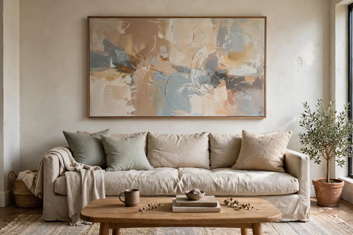
A single oversized piece creates the calmest, most formal look. One canvas or framed print, sized to two-thirds of the sofa, gives the eye a clear focal point and simplifies every other styling decision. Horizontal formats suit the wide wall above a sofa better than vertical ones, and a wide abstract composition is the most forgiving choice because it does not demand a specific subject.
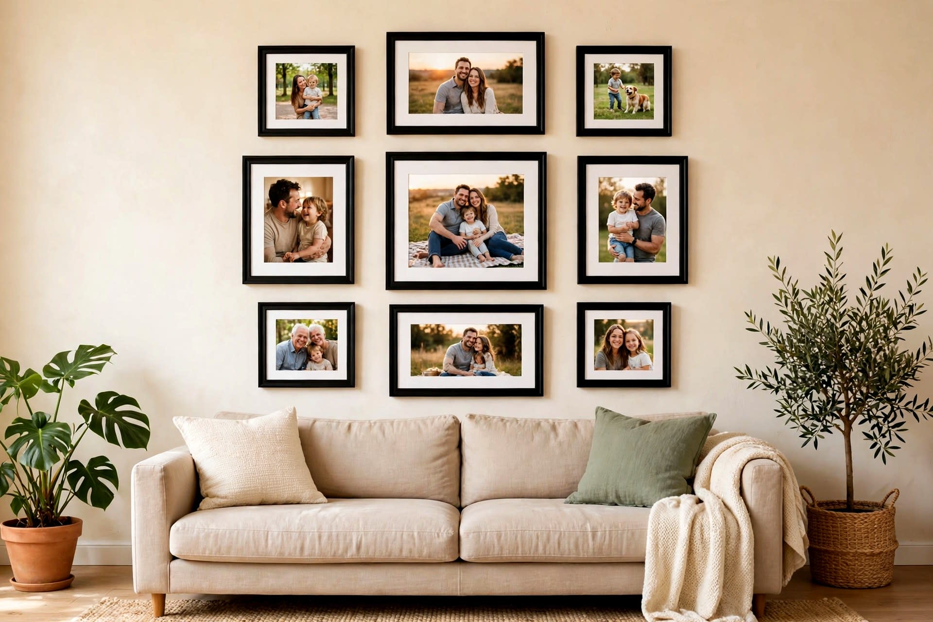
A gallery wall adds personality and depth. The rule does not change: the whole grouping is one block, two-thirds of the sofa's width, with its bottom edge 6 to 10 inches above the sofa back. Start with the largest piece slightly off-center and build outward, keep gaps even at 2 to 3 inches, and keep the center of the whole grouping around eye level. Our gallery wall layouts guide covers the arrangements in detail, and gallery wall templates gives you layouts you can copy directly.
A triptych or matched set is the middle path: three coordinated panels, evenly spaced, read as one intentional piece without the planning a full gallery wall takes. For a standard 84-inch sofa, three panels of about 16 inches each with 4-inch gaps land almost exactly on the two-thirds target, which is worked out below.
A picture ledge is the flexible option. Fix one or two ledges above the sofa, lean frames on them, and layer taller frames at the back with smaller ones overlapping in front. You can swap art in seconds, add small objects, and you only drill for the ledges themselves. Painting the ledge the same color as the wall makes it disappear and lets the art float.
A leaning piece works if you have a foot or so of space behind the sofa. Pull the sofa out from the wall, lean a large piece of art behind it, and add a lamp or two for depth. It is also the most renter-friendly approach of all, since it needs no holes whatsoever.
A mirror follows exactly the same sizing rules as artwork, and it has the bonus of bouncing light and doubling visual depth. Rectangular mirrors suit modern rooms; round mirrors soften the space. The full mirror playbook is in mirror wall decor ideas.
The gallery math, worked out
Here is the arithmetic for the most common case, a standard 84-inch sofa, so you can check your own plan the same way.
- Sofa width: 84 inches
- Target art width: 84 times two-thirds = 56 inches
- Three frames at 16 inches: 48 inches
- Two gaps at 4 inches: 8 inches
- Total: 48 + 8 = 56 inches
That is the whole method: multiply the sofa width by two-thirds, then divide that total across your frames plus the gaps between them. For a larger example, a 200 cm sofa wants an arrangement about 138 cm wide, which you can reach with two rows of four 30 by 30 cm frames with 6 cm gaps, or a single calmer row of three 40 by 50 cm portrait frames with 8 cm gaps, which measures 136 cm across. For a 250 cm sofa, three 50 by 70 cm frames with 8 cm gaps give 166 cm, right in range.
Before you commit to nails, plan the arrangement on the floor, or trace each frame on kraft paper, tape the templates to the wall, and live with them for a day. Paper templates cost nothing to shift; nail holes do not.
When the rules disagree
The three numbers agree in most rooms, but three situations break the tie, and each has a clear answer.
Tall sofa backs. When the sofa back is tall, the 57-inch center line and the 6 to 10 inch gap disagree: following the center line would push the art too far above the furniture. The sofa rule takes priority. What matters is how the art sits against the furniture, not a number measured from the floor.
Low ceilings. Resist the urge to shrink the art. Keep the two-thirds width and the 6 to 10 inch gap, leaning toward the 6-inch end, and let the art sit slightly higher than eye level rather than buying a smaller piece to hit the center line.
Sectionals and very wide sofas. Above about 110 inches, stop looking for one piece. A triptych, a gallery grouping, or a pair of large pieces with a small object between them will fill the wall without any single piece looking lost.
No furniture below. On an open wall with nothing beneath, the furniture rules do not apply, and the 57-inch center line takes over: center the piece at eye level and fill 60 to 75 percent of the wall's width.
Renter-friendly ways to fill the wall
Renters face the same blank wall, with the added constraint of the deposit. Three approaches cover nearly every case.
Picture ledges are the best renter investment for this wall: two ledges, a handful of frames, and the whole display can change with the seasons. Layer frames deeply for the current collected look, and paint the ledge to match the wall so it disappears.
Leaning art needs no holes at all if there is room behind the sofa. A large canvas leaned against the wall, flanked by a floor lamp, looks deliberate rather than temporary.
Adhesive strips work for lighter pieces, but the weight limit is real: four pairs of large picture hanging strips support a frame of up to 16 pounds and 24 by 36 inches, according to the manufacturer's specifications. Weigh each frame on a bathroom scale first, and move to a wall anchor for anything heavier. The wider no-drill toolkit is covered in damage-free wall decor and renter-friendly wall decor.
If the sofa itself is the problem rather than the wall, small living room sofa covers choosing the right sofa for a small room, and small gallery wall ideas adapts gallery rules to tight spaces.
Style choices that make it look intentional
Sizing gets the art to the right place; these choices make it look like it belongs there.
Tie the palette to two other elements. The art's colors should repeat in at least two other things in the room: a cushion, a rug, a throw, a vase. That repetition is what turns a nice print into a considered room.
Keep one frame family. Frames do not need to match exactly, but they should belong to one family: all black, all natural wood, all brass, or all white. A gallery wall with five different frame finishes reads as a yard sale; one family reads as a collection.
Leave breathing room. Do not fill every inch. Negative space around the art, and between the art and the ceiling, is what lets the piece command the wall. Clustering small frames around a large statement piece usually hurts it: give the statement piece the wall to itself.
Add light if you can. A pair of wall lamps flanking the art, or a picture light above it, fills visual space, adds evening warmth, and lets you skip bulky side tables if you do not need them.
Mistakes to avoid
Buying too small. The single most common error. A small print centered above a large sofa looks lost, not deliberate. The newspaper test catches it: stand three meters back and hold up a sheet at the size you are considering. If it looks tiny, go up a size.
Hanging too high. People measure from the ceiling or hold the frame at standing eye level, and the art ends up floating a foot above the sofa. Measure the gap from the sofa back, not from the ceiling.
Centering on the wall instead of the sofa. The art belongs to the sofa, so center it on the sofa. On a wall where the sofa sits off-center, art centered on the wall will look disconnected from the furniture it is supposed to anchor.
Uneven gallery spacing. Gaps of 2 inches here and 5 inches there make a gallery wall look accidental. Pick one gap size, usually 2 to 3 inches, and keep it everywhere.
Too many types on one wall. A gallery wall plus a shelf plus a mirror plus a wall sculpture on the same stretch of wall is a showroom, not a living room. Pick one approach for the sofa wall and let the other walls carry the rest.
FAQ
How high above a sofa should you hang art?
Hang the bottom of the frame 6 to 10 inches above the top of the sofa back, with 8 inches as a reliable default. In rooms with lower ceilings lean toward 6 inches; in taller rooms 10 works well.
How wide should art be above a sofa?
About two-thirds to three-quarters of the sofa's width. For an 84-inch sofa, that is 56 to 63 inches of art, whether it is one piece or a grouping treated as a single block.
Should you put one large piece or a gallery wall above a sofa?
Both work. A single large piece creates a calm, minimal look, while a gallery wall adds personality and depth. Whichever you choose, the total width must still follow the two-thirds rule.
Can you hang a mirror above a sofa instead of art?
Yes. A mirror follows the same sizing rules as artwork and can make a room feel brighter and larger by reflecting light. Rectangular mirrors suit modern interiors; round mirrors add softness.
What if my sofa is against a wall that is much wider than the sofa?
Center the art on the sofa, not on the wall, and size it to the sofa. To fill the remaining wall, add a floor lamp, a tall plant, or a second smaller arrangement on the other part of the wall, rather than stretching the sofa art wider than the two-thirds rule allows.